LIFE AskREACH branding
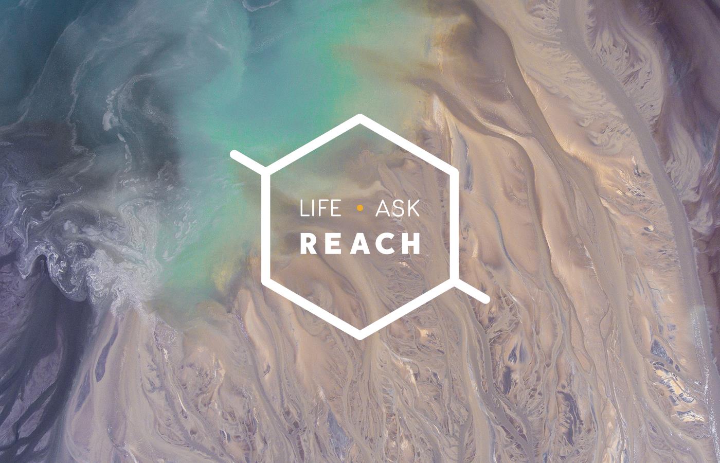
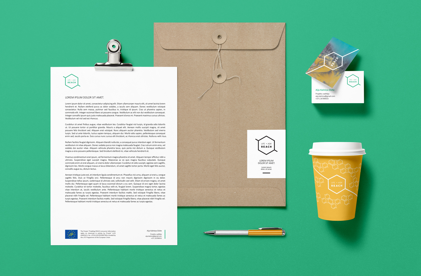
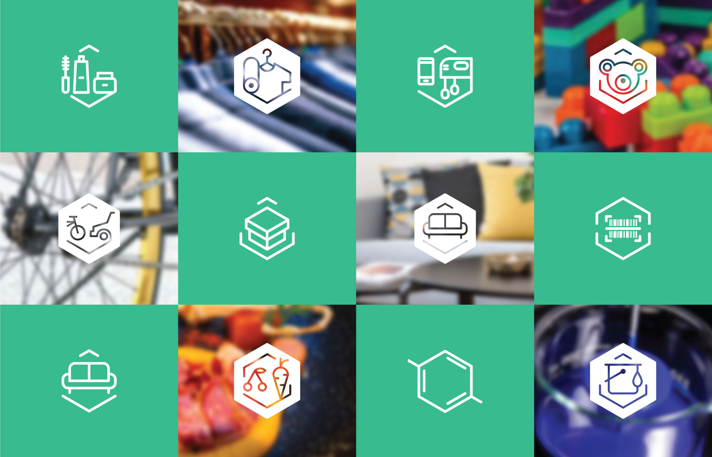
Bright has created a brending for LIFE AskREACH project, which will make it easier for people across Europe to see whether various consumer products contain highly dangerous substances.The shape of logo creates associations with molecules, therefore underlining the meaning of REACH (EU regulation regulating the circulation of chemicals). Chosen font is easily perceived by human eye, letting person not only focus on the name of the project, but also to remember it easily. Usage of chemical bonds adds dynamic to logo and creates the feeling that it does not end with hexagon, but continues indefinitely. If one of chemical bonds is covered, logo reminds of a magnifying glass, which represents looking for answers.
Mint green and orange are used because mint green is often associated with energy and wisdom as much as emotional balance and loyalty. With an emphasis of orange, the colours together create association with friendliness and trustworthiness.


